Choosing colors and prints for a quilt is easier when you stop trying to find “perfect” fabrics and start building a balanced fabric pull. A good beginner quilt usually needs a clear color palette, contrast between light and dark fabrics, and a mix of print sizes so the design does not look flat or too busy.
Start with one fabric you love, a simple color idea, or the room where the quilt will live. Then add fabrics that support that choice instead of competing with it. For beginning quilting, choosing colors and prints is less about strict rules and more about making sure each fabric has a job in the quilt.
Quick Answer
The main takeaway: choose quilt fabrics by balancing color, value, and print scale. Color gives the quilt its mood, value creates contrast, and print scale keeps the surface interesting without becoming chaotic.
A beginner-friendly process looks like this:
- Pick a starting point. Use a favorite print, a bundle, a photo, or two colors you already like.
- Choose a limited palette. Three to five main colors is usually easier than ten.
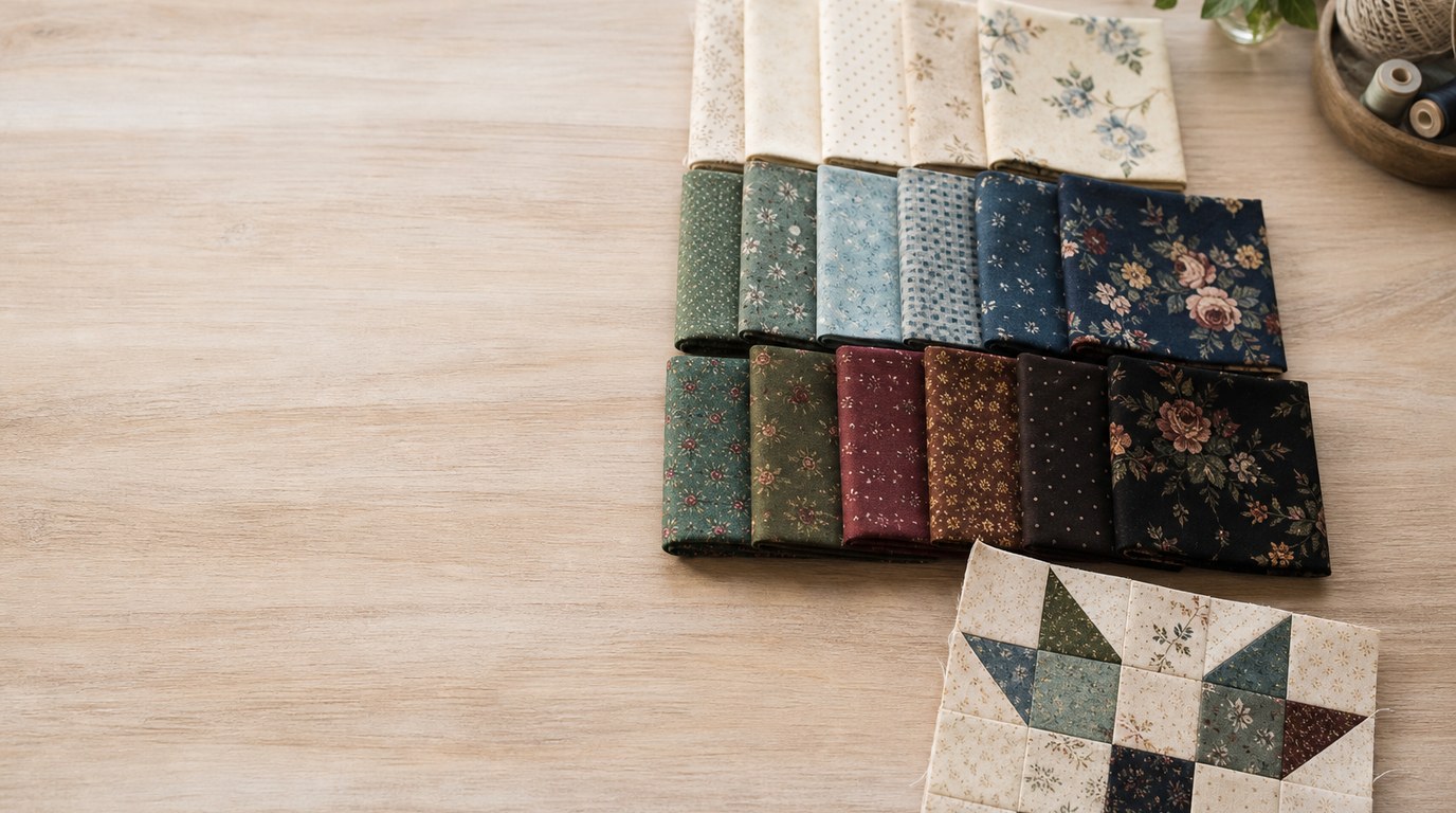
- Check value. Include light, medium, and dark fabrics so blocks and shapes are visible.
- Mix print sizes. Combine large prints, small prints, and quieter blender fabrics.
- Match fabric to the pattern. Detailed quilt blocks often need simpler prints; large patchwork pieces can handle bolder designs.
- Lay everything out together. Look at the fabrics as a group before cutting.
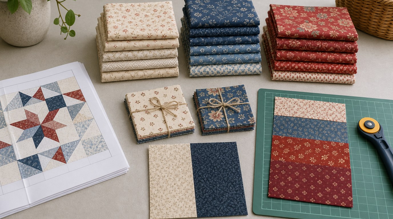
For example, if you choose a navy floral as your main fabric, you might add cream for light contrast, dusty pink from the floral for softness, a small navy dot for texture, and a medium green leaf print for variety. The quilt will feel coordinated because the colors repeat, but it will not feel boring because the prints have different scales.
A quick test is to take a photo of your fabric pull and view it in black and white. If every fabric looks like the same gray, the quilt may lack contrast. Add a lighter or darker fabric before you start sewing.
How to Think About This Topic
When you are new to quilting, fabric selection can feel like the hardest part because every bolt looks tempting. The useful mental model is to think of a quilt as a team, not a collection of favorite fabrics. Each fabric should play a role: a star, a helper, a background, a contrast fabric, or a quiet place for the eye to rest.
That matters because quilts are seen from different distances. Up close, you notice cute flowers, dots, stripes, novelty prints, and texture. From across the room, you mostly see color blocks and contrast. A fabric that looks beautiful in your hand may disappear in the finished quilt if it is too similar to the fabrics beside it.
For beginning quilting, choosing colors and prints works best when you separate three decisions:
- Color: What hues are in the quilt?
- Value: How light or dark are those fabrics?
- Print scale: How large or small are the designs on the fabric?
Color is what most beginners think about first. You might want blue and white, autumn colors, cheerful brights, or soft pastels. That is a good starting point, but color alone does not guarantee a strong quilt. If every blue fabric is medium-dark, the blocks may blend together. If every fabric is a loud print, the quilt may feel visually crowded.
Value is often the hidden ingredient. Light, medium, and dark fabrics create separation between pieces. Many traditional quilt blocks rely on value contrast more than color contrast. A pale blue and a pale pink may technically be different colors, but they may not stand apart in a block. A pale blue and navy will usually show the pattern more clearly.
Print scale is the final balancing tool. Large florals, big geometrics, or novelty prints can be beautiful, but they need room. Small prints, tone-on-tone fabrics, solids, and blenders help support them. If every fabric is a large print, the eye has nowhere to rest. If every fabric is tiny and low-contrast, the quilt may look flat.
A simple way to judge your fabric pull is to ask: What do I want people to notice first? If the answer is the block design, choose stronger value contrast and calmer prints. If the answer is the fabric itself, use simpler blocks and let one or two standout prints lead the quilt.
| If your fabric pull looks… | What may be happening | Try this fix |
|---|---|---|
| Too flat | Values are too similar | Add a very light or very dark fabric |
| Too busy | Too many bold prints | Add solids, tone-on-tones, or small blenders |
| Uncoordinated | Colors do not repeat | Repeat at least one color in several fabrics |
| Dull | No fabric stands out | Add one focal print or accent color |
| Choppy | Too many unrelated styles | Remove one fabric family and simplify |
This approach keeps the decision practical. You are not trying to master all of color theory before your first quilt. You are learning to build a group of fabrics that works for the pattern you plan to sew.
Practical Guidance
Start with the quilt pattern before buying all your fabric. Some patterns are designed for fat quarters, some for precuts, some for scraps, and some for strong light-dark contrast. The pattern will tell you how many fabrics you need and often whether they should be background, accent, or feature fabrics.
If the pattern has many small pieces, use prints that will still read clearly when cut small. Tiny stars, dots, gingham, small florals, and tone-on-tone designs usually work well. A large scenic print may lose its charm if it is chopped into two-inch squares. Save large-scale prints for borders, big blocks, simple patchwork, backing, or patterns with larger pieces.
A reliable beginner method is to start with a focal fabric. This is usually the busiest or most colorful print in the quilt. Pull two or three colors from that fabric and choose supporting fabrics in those colors. For instance, a woodland print with teal, rust, cream, and brown could lead to a palette of teal, rust, cream, and one dark brown accent. This makes the quilt feel intentional without needing complicated planning.
Next, choose a background. Background fabric is often white, cream, gray, navy, black, or another quiet solid or near-solid. It should contrast with most of the main fabrics. If your quilt uses pale pastels, a white background may be too soft if you want the blocks to pop; cream, charcoal, or a deeper pastel might work better depending on the look. If your fabrics are dark jewel tones, a light background can make the design clearer.
Then check value. Lay fabrics in a row from lightest to darkest. You do not need an equal number of each, but you do need enough difference for the pattern to show. Taking a black-and-white phone photo is one of the easiest beginner tools. If two fabrics become nearly identical in grayscale, avoid placing them next to each other in parts of the block that need contrast.
After value, check print scale. A balanced pull might include one large floral, two medium geometrics, several small prints, and a few solids or blenders. Blenders are fabrics that read almost like one color from a distance but have subtle texture, dots, crosshatch, or tonal print up close. They are extremely useful because they connect louder fabrics without adding clutter.
Also consider color temperature and mood. Warm colors such as red, orange, yellow, peach, and rust often feel energetic or cozy. Cool colors such as blue, green, lavender, and aqua can feel calm or fresh. You can mix warm and cool colors, but choose which one will dominate. A mostly blue quilt with small mustard accents will feel different from a mostly mustard quilt with blue accents.
Do not forget scale in relation to the finished quilt. Baby quilts and wall hangings are viewed closer, so small details show well. Bed quilts are often seen from farther away, so stronger contrast and larger color areas may read better. If you want a pattern to be visible on a queen-size quilt, avoid using fabrics that all blend into the same middle value.
Before cutting, make a quick mock layout. You can place folded fabric on a table, use the coloring page from the pattern, or take a photo and rearrange fabrics mentally. Ask three questions:
- Can I see a clear light, medium, and dark range?
- Is there one main style or mood?
- Do the busiest fabrics have calmer neighbors?
Common mistakes are easy to fix before sewing. Avoid buying only favorite bold prints with no background or quiet fabrics. Avoid choosing fabrics under poor lighting, because colors can shift at home. Avoid assuming that different colors automatically create contrast. And avoid using a precious large print in tiny pieces unless you are comfortable with the design being cut apart.
Precut bundles, such as charm packs, jelly rolls, and layer cakes, can help beginners because the colors are already coordinated. However, they still may need a background fabric or extra contrast. Do not assume every fabric in a bundle must go into the quilt. If one print feels wrong, leave it out.
The final practical rule is simple: if the fabrics look good together in a stack but confusing when spread out, edit the pull. Remove one busy print, add a quiet fabric, or increase contrast. A quilt does not need every beautiful fabric you own. It needs the right group for this particular project.
FAQ
What Should a Beginner Know First About Beginning Quilting Choosing Colors and Prints?
Start with balance, not perfection. A beginner quilt needs colors that repeat, values that create contrast, and prints that vary in size. Choose a simple palette, include light and dark fabrics, and make sure busy prints have quieter fabrics beside them.
What Matters Most When Evaluating Beginning Quilting Choosing Colors and Prints?
Value usually matters most after the basic color palette. If fabrics are too similar in lightness or darkness, the quilt pattern may disappear. Check your fabric pull in black and white to see whether the design will have enough contrast.
What Mistakes Should Readers Avoid with Beginning Quilting Choosing Colors and Prints?
Avoid using only bold prints, ignoring background fabric, or choosing fabrics that are all medium value. Also avoid cutting into large feature prints before checking whether the pattern pieces are big enough to show the print clearly.
What Is the Next Logical Step After Learning About Beginning Quilting Choosing Colors and Prints?
Choose a simple quilt pattern and make a small fabric pull for it. Lay out your fabrics, check color, value, and print scale, then edit before cutting. A baby quilt, table runner, or throw-size pattern is a good practice project.