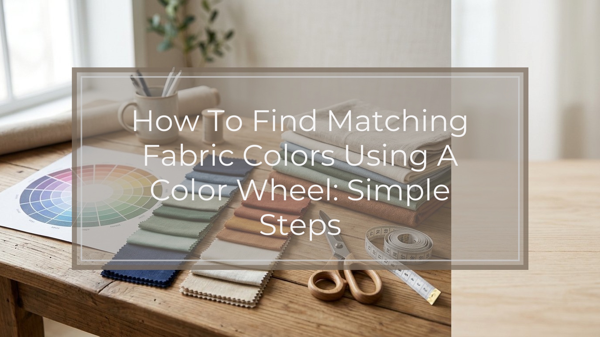
If you want fabric colors to look coordinated, start with one main fabric or one anchor color, find that color on a color wheel, and build around it using a simple scheme: complementary for contrast, analogous for a soft blended look, or triadic for lively balance. Then check value and intensity, not just hue. In fabric, two colors can be “correct” on the wheel but still clash if one is very bright and the other is dusty, or if both are the same darkness. The easiest beginner method is to choose one hero fabric, pull two or three supporting colors from it, and test the group in natural light before cutting.
Quick Answer
The fastest way to find matching fabric colors using a color wheel is this:
- Complementary: opposite colors for strong contrast, like blue and orange.
- Analogous: neighboring colors for a calm look, like blue, blue-green, and green.
- Triadic: three evenly spaced colors for a more playful mix, like red, yellow, and blue.
- Value = light or dark
- Intensity = bright or muted
- Pick your starting point: one solid fabric, one print, or one color you know you want.
- Find its general color on the wheel.
- Choose a scheme:
- Adjust for value and intensity:
- Limit the palette to about 3 main colors plus a neutral unless the project needs more variety.
The main takeaway: a color wheel helps you choose colors that relate well, but fabric matching gets better when you also compare undertone, brightness, scale of prints, and lighting. For quilting, garment sewing, home decor, and crafts, that extra check is what keeps a palette from looking accidental.
How to Think About This Topic
A color wheel is best used as a map, not a rulebook. It shows which color families naturally create harmony or contrast, but your real job is choosing fabrics that feel balanced in a finished project.
A practical way to think about fabric matching is to make decisions in this order:
- Hue: what color family it belongs to
- Value: how light or dark it is
- Intensity: how clear, bright, soft, or dusty it looks
- Amount: how much of each color will appear
That order matters because beginners often stop at hue. They pick colors that “match” on the wheel but ignore how those fabrics behave together. A pale sage green and a sharp neon pink may be technically compatible in some schemes, but they probably will not feel cohesive in a quilt or cushion cover unless the style intentionally calls for that contrast.
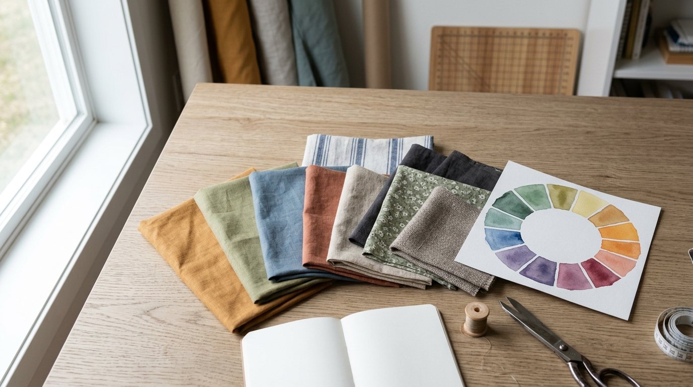
Start by identifying an anchor color. This is the color that leads the palette. In sewing, that might be the background fabric, the largest print, or the fabric you already own and want to use. Once you know the anchor, the wheel helps you choose supporting colors with more confidence.
Here is the simple mental model:
- Want a quiet, blended look? Use analogous colors.
- Want a crisp focal point? Use complementary colors.
- Want energy without randomness? Use triadic colors.
- Want the project to feel easier to use or decorate with? Add a neutral such as cream, gray, navy, tan, denim blue, or black.
This matters for the search intent because most people asking how to find matching fabric colors using a color wheel do not need art-school theory. They need a reliable way to pick fabrics for real projects. For example:
- A quilt may need variety without looking chaotic.
- A dress may need accent fabric that flatters the main fabric.
- Throw pillows may need enough contrast to stand out on a sofa without fighting the room.
So use the wheel to choose relationships, then use your eye to balance mood, scale, and proportion.
Practical Guidance
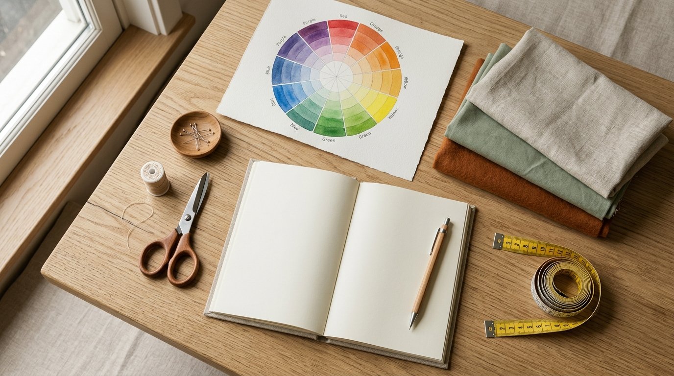
Once you understand the wheel, use this simple process when shopping or pulling from your stash.
First, choose your hero fabric. If it is a print, do not try to match every color in it. Pick one or two colors from the print to lead the palette. That keeps the rest of the choices focused.
Then use this reference:
| If you want this look | Use this color-wheel relationship | Fabric example |
|---|---|---|
| Calm, blended, easy to coordinate | Analogous | Blue floral with teal and soft green solids |
| Bold but balanced contrast | Complementary | Rust print with navy or blue accents |
| Bright, playful, more modern | Triadic | Mustard, denim blue, and brick red |
| Soft and classic | One main hue plus tints, shades, and neutrals | Blush, rose, burgundy, cream |
| Safe for beginners | Print plus two pulled colors and one neutral | Multicolor quilt print with coral, leaf green, and ivory |
Use the Wheel in Five Practical Steps
1. Match the dominant color, not tiny accents.
If a print is mostly warm blue with a little yellow detail, treat blue as the anchor. Tiny accent colors can support the palette later.
2. Compare warm versus cool versions.
Not all reds, blues, or greens are the same. A blue with a violet cast behaves differently from a blue with a green cast. If fabrics seem slightly “off” together, the temperature may be the problem.
3. Balance lights, mediums, and darks.
A palette often looks better when it has contrast in value. In quilting, this helps shapes stand out. In home decor, it keeps a set of fabrics from blending into one flat block of color.
4. Mix prints with solids carefully.
If you have one busy print, let solids repeat its main colors. If you use several prints, vary the print scale: one large, one medium, one small. Color harmony works better when pattern competition is controlled.
5. Test before committing.
Lay swatches together, then step back. Squint at them. Take a photo in daylight. If one fabric jumps out for the wrong reason, replace it with a lighter, darker, brighter, or duller version of the same hue.
Real-world Examples
Quilting:
You have a floral print with coral, olive, and cream. A safe palette is coral, olive, cream, and one deeper accent like muted navy. On the wheel, coral and olive are not simple opposites, but the navy adds value contrast and helps ground the set.
Garment sewing:
You are making a navy skirt and want a blouse fabric that works. A complementary option is soft rust or muted orange. A calmer option is blue-green or teal. If the skirt is dark, a blouse in a lighter value usually feels easier to wear.
Home decor:
For pillows on a beige sofa, start with one patterned fabric containing terracotta and dusty blue. Pull terracotta for warmth, dusty blue for contrast, and cream as the neutral. That gives the group shape without overwhelming the room.
Common Mistakes to Avoid
- Matching only by “same color name”
- Ignoring brightness differences
- Using too many equal-strength colors
- Picking every color from a print instead of editing
- Judging under store lighting only
If you are unsure, simplify. One print, two supporting colors, and one neutral is usually enough for a polished result.
FAQ
What Colors Match Best on a Color Wheel for Fabric?
The best match depends on the look you want. Analogous colors give a soft, coordinated effect. Complementary colors create contrast. Triadic schemes feel lively. For most fabric projects, the easiest combination is one main color, one supporting color, and one neutral.
How Do I Match Fabric Colors If One Fabric Is Printed?
Pick the dominant color in the print first, then pull one or two secondary colors from it. Add a solid neutral if needed. Do not match every small accent in the print, or the palette can start looking busy and unfocused.
Can Warm and Cool Fabric Colors Work Together?
Yes, if the mix looks intentional. A warm rust with a cool navy can work very well. The key is balance: repeat each temperature somewhere, or connect them with a neutral or muted print so the combination feels deliberate.
How Many Fabric Colors Should I Use in One Project?
For beginners, three main colors plus a neutral is a strong starting point. Quilts and scrappy projects can use more, but they still look better when the colors share a clear relationship in value, temperature, or wheel placement.
Why Do Fabric Colors Look Different at Home Than in the Store?
Lighting changes color perception. Store lights may make fabrics look cooler, warmer, brighter, or flatter than they really are. Always check swatches in natural light and in the room where the project will be used before making a final choice.